
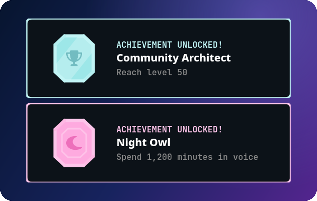
In brief: An achievement card should let a member understand the accomplishment in one glance: what they earned, why it matters, and how rare it is. The visual treatment supports the milestone; it does not replace a clear requirement.
Put information hierarchy before decoration
The title is the fastest scan: “Raid Regular” is easier to remember than a sentence-length joke. The description explains the exact accomplishment. The icon makes the category recognizable. Tier and plaque treatment communicate rarity. At Discord’s small attachment sizes, high contrast and short copy matter more than intricate art.
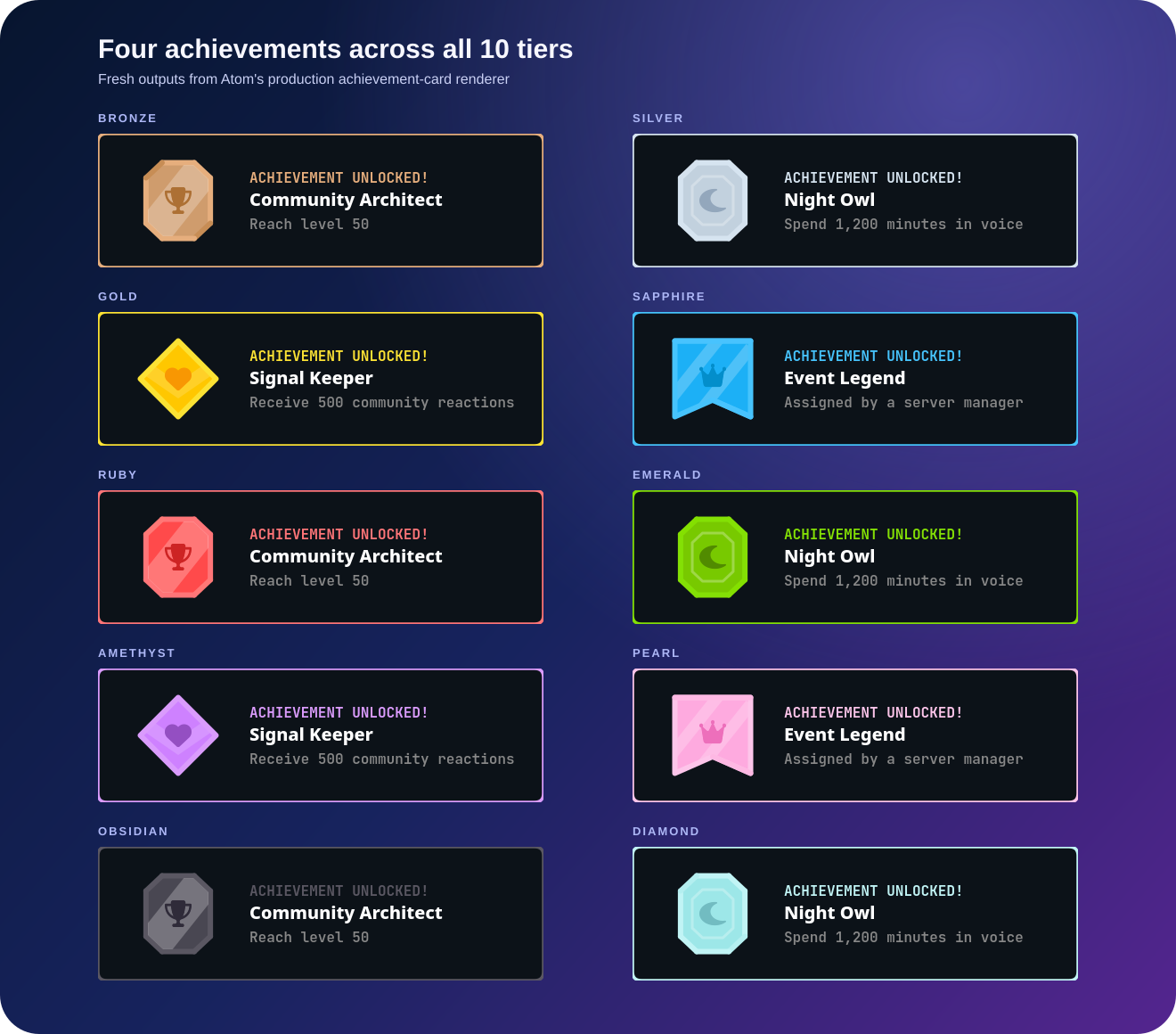
Atom’s preset system pairs a tier with five plaque shapes, independent plaque treatments, and a selected icon. Eligible Superatom servers can use a custom plaque with configurable card text colors. Keep the system consistent enough that members can identify the collection, while allowing rare moments to feel distinct.
Make rarity visible and believable
Use the strongest visual treatments—such as Obsidian and Diamond—for achievements that have lasting status. This might be a community-defining event, a difficult progression finale, or a rare staff-recognized contribution. Their visual prestige works only when members trust the requirement.
Use a common card for an early welcome milestone, then step up deliberately. Do not make all cards look equally scarce; it makes the collection harder to read and the rare unlocks less satisfying.
Design for the unlock and the archive
A card appears first as an announcement and later as part of a member’s achievement collection. Test both contexts. The announcement needs a clear title and short reveal; the archive needs enough description to explain the card months later.
Avoid embedding text into decorative plaque art where it cannot adapt to a long title or be read on mobile. Use the product’s text fields for content and artwork for the identity layer.
test achievement announcements · explore Atom card customization
Build a collection with intent